
Legacy, pride and future plans - The past and future of Sheffield Wednesday's 'new' club crest
The Owls is back. Alex Miller looks back on its legacy - and its future.
In his later life, Robert Walker could often be found doodling. A talented artist whose work took on all forms, he worked centrally for Rotherham Borough Council in their printing a legal department, designing and producing leaflets and brochures. Art and design was his passion. He sadly died in April 2020.
The subject of so many of those aged doodlings lives on and has been reimagined to the excitement of tens of thousands in South Yorkshire. He retired to a life on a houseboat, taking in the beauty of the country’s waterways and using that for inspiration for his art. But it was in quieter moments the pen would take him to his best-known work; the Sheffield Wednesday Owl.
“He did like to doodle it he did he did carry on drawing it in his in his later life, he used to kind of do it on the spot,” Robert’s daughter Jayne Davison told The Star recently having been unaware of the return of the crest by the club’s new owners in the last weeks. “As a family we're thrilled that his legacy lives on and I know if he was alive today he would be equally as thrilled, absolutely. It's a really nice legacy for him.”
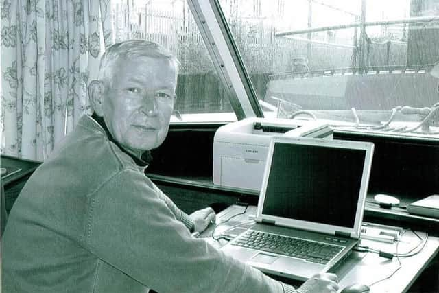

As told in a Star article shortly after Robert’s death from an epileptic seizure some six years ago, the family are not football nuts and have no strong affiliation to any team. The then-student - whose design of ‘Ozzie’ was chosen as the club’s new crest back in 1973 as senior figures sought to trademark a new badge and sidestep the increasing threat of counterfeiters - even turned down the offer of a free season ticket, such was his football ambivalence. Needless to say, it did provide a strong addition to his coursework portfolio.
Robert’s family take great pride in the legacy the Owl strides on with - and that it will be reinvigorated in Wednesday’s new dawn. Told that the return of the badge was one of the first moves the club’s new owners had made, and of the reception it had received from the club’s vast fanbase, Jayne paused for a moment in contemplation.
“We’re very fond of it,” she continued. “There’s just that bit of sadness that he's not here to see it come back, because obviously when when dad died it was it was the the other version, the other crest as it was. He'd just be very proud. It's iconic and everyone knows it. You speak to people and for some people it’s known internationally, it’s not just one of the other football crests and logos, it has to be one of the most iconic ones.
“He was just a normal guy. Dad didn't leave school with many qualifications, but he had talent for for arts and went to Granville College to do graphic design. It was amazing that he came up with that really and that it’s still seen so fondly by so many people.”
The new, digitalised design was carried-out by local design agency Peter & Paul, who were engaged by David Storch as the new ownership sought to deliver the club’s image back to its roots. Consultation was had with members of the Sheffield Wednesday Supporters Trust and Wednesday fan and graphic designed Lee Wildgoose, who had submitted his own designs for perusal having spent time assisting the club during its administration.
Peter and Paul chose not to comment to The Star on the design, though agency founder Peter Donohue told trade outlet Prolific North: “Sheffield Wednesday means a huge amount to this city and to so many people in it – me included. It’s a club with incredible history and loyalty, but it’s fair to say that connection hasn’t always felt as strong in recent years.
“I’m so proud that we’ve been trusted by the new ownership to support a fresh start. Our ambition is simple; to help shape a better Wednesday, on and off the pitch, built with the spirit of the city at its heart.”
Lending his trained eye to the subtle changes made to the badge, Lee explained the modernisation of the badge for digital usage - and offered an insight into its potential going forward.
“The original drawing was obviously taken from a hand-drawn version, so there was never a real digital consistency to the logo,” he explained. “What they've done is made all the curves more actual circles, so there's a proper curve to it now. On the chest for example, that curve before was basically just a hand-drawn curve, whereas now it's got a proper circular curvature to it, so it's more uniformed. They've also raised up the tail feather as well, so that interacts directly with the chest, so you've got that line going through for consistency.
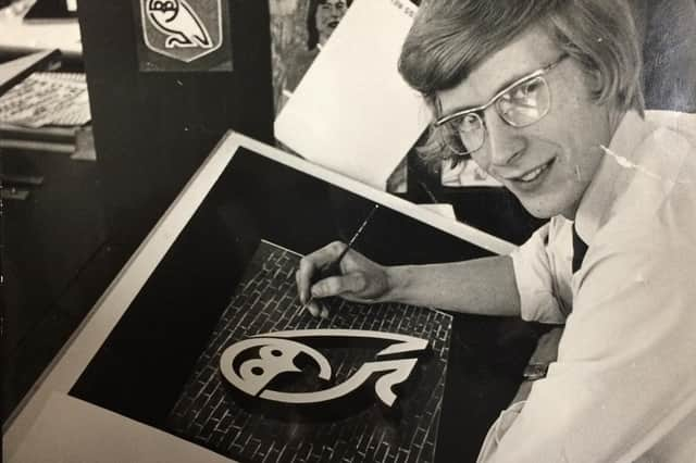
“And then also with the claw as well, they've designed that to angle into the W, so the owl part ties into the text underneath it. And then the back's being sorted out compared to the crooked back on the last version, and then the spacing around the head, they've increased that ever so slightly. That means that when its pulled down to the smallest scale, on phone screens for instance, you'll still see that definition of the breakage. Before, it would blur in.”
The grand idea for the badge appears to be dynamism, where in the longer-term wording beneath the Owl itself can be altered dependent on the style or garment or promotional material. Even longer-term, it is suggested, is that Ozzie becomes its own brand ID. The club’s new owners are said to be working towards a faraway plan for global recognition. One day, the ‘SWFC’ wording can be dropped and people will know what the Owls represents at a glance.
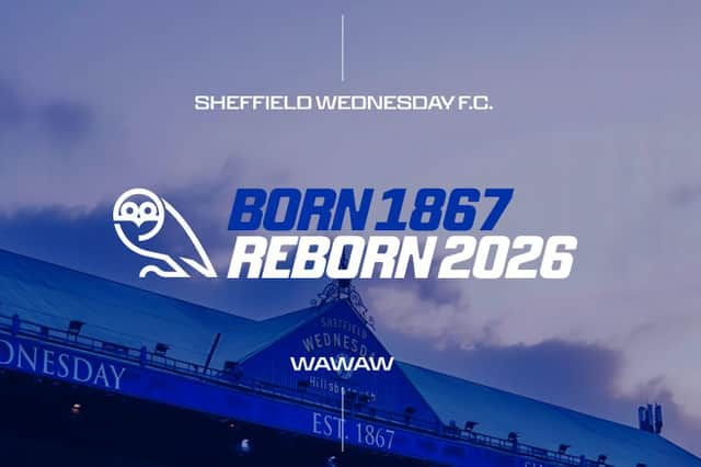
“It's done in a proper way, but the font is basically it's a dynamic font, so as you see on the current logo, that's one way that you'll set it up,” Lee continued.
“There'll be instances where it'll be italicised, there'll be instances where it'll be really wide, other times where it'll be really narrow. There's also indications that sometimes it'll say Owls underneath the badge, sometimes it'll say WAWAW under the badge, so it's going to be a very dynamic and fluid system. It's going to be quite a funky look. As I understand it, they're not putting the SWFC under the badge on everything, so there'll be some shirts that don't have it.
“I think one term goal is it'll just be the Owl. I’d say this is the new version that's instantly recognisable and in a few years' time probably we'll just reform back to just a single Owl.”
Not a great deal of Robert’s original artistry is in the hands of the family and efforts are to be made to retrieve some prints going forward. Earlier this week, Jayne Davison received a visit from her aunt - Robert’s sister - who brought her some drawings her father had done in the latter stages of his life. They were of Ozzie Owl, and the suspicion is that he had intended to colour them in. He never got round to it.
Gladly, Robert Walker’s legacy has been given new life.