Sheffield Wednesday: the good, the bad and the ugly - nine classic Owls kits
By The Newsroom
Published 28th Feb 2019, 14:03 GMT
Love them or loathe them, every year football teams get a redesign of their kits and fans rush out to buy the new shirt.
Here's a trip down memory lane to look back at nine Sheffield Wednesday kits - good, bad and ugly - over the years.
Sheffield Wednesday
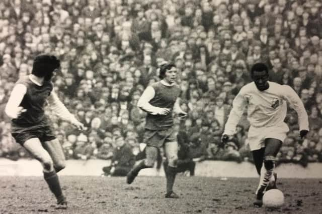
The Owls first major departure from classic blue and white stripes was a blue shirt with white sleeves, worn here against Pele's Santos in 1972.
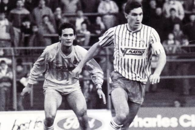
Wednesday turned to a thinner stripe for this Umbro designed home kit in 88/89.
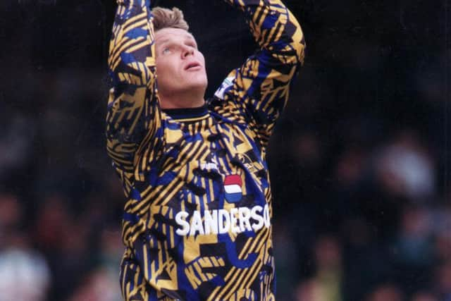
This headache-inducing goalkeeper kit has the 90s written all over it... well it actually has SWFC written all over it. That's one way to distract the opposition strikers.
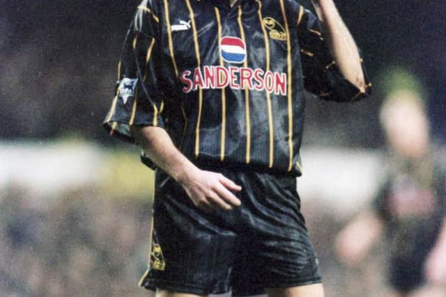
This classy black and gold effort from the 93/94 season was a great effort from kit designers Puma.
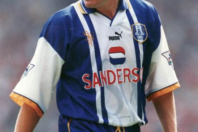
Another different take on the classic blue and white stripes from Puma, this time with classy yellow accents and a white central panel.
A classic from Puma with the trusty blue and white stripes and a black and blue collar. The umbrella isn't bad either!
This effort is one way to force the opposition to wear sunglasses and is one of the more garish away strips in the Owls' recent history!
Puma produced this kit for Wednesday for the 2012/13 season and it features much more black than most kits before or since with the shoulder stripe, shorts and socks.
Last season's home kit was the first designed by Elev8 and saw a return to the plain blue body and white sleeve look, with stripes still featuring on the socks.