Alan Biggs: Red missed? Too white. Blades kit fails to inspire


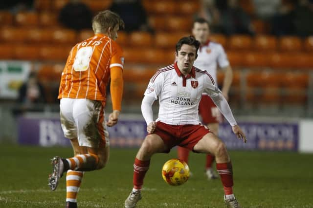
I refer to the home shirts – which can only be described as white from any distance. The thin red pinstripe might as well not be there. This, for me, goes deeper than a break from tradition (hopefully for one season only).
Ask yourself what colour most closely associates with the blood and thunder football of United’s most successful eras of modern times?
Advertisement
Hide AdAdvertisement
Hide AdIt was red raw that symbolised the approach under Dave Bassett and Neil Warnock that made visitors fearful.
Bramall Lane carries no such apprehension these days and those wishy-washy shirts have to be a contributory blunder, if not as much to blame as those inside of them.
There is no disguising that position and performance are simply not good enough currently. But things can’t be all bad when a third tier outfit can keep attracting 19,000 crowds.
While there is that much of a will, there has to be a way. Eventually.